Configure a semantic model

Mohamad's interest is in Programming (Mobile, Web, Database and Machine Learning). He is studying at the Center For Artificial Intelligence Technology (CAIT), Universiti Kebangsaan Malaysia (UKM).
Semantic models organize complex data into an intuitive structure, enhancing data visualization and enabling efficient, insightful reporting for better decision-making.
Learning objectives
In this module, you learn how to:
Set modeling options.
Create and configure relationships.
Configure table and column properties.
Create hierarchies.
Create quick measures.
Create numeric range and field parameters.
[1] Introduction
This module explains how to design a semantic model, which is the task you undertake as a data modeler once you apply your Power Query queries. At this point in your development, you have a model comprising one or possibly more tables—but there's more work to be done. Your goal is to develop a model that supports the reporting requirements, and that's user-friendly and intuitive. Essentially, you're developing a semantic layer over the data.
Your first design efforts should focus on configuring the relationships between model tables. You can then move on to enhance the model design by setting table and column properties, and by creating other model objects, like hierarchies, measures, and parameters.
Note
This module focuses on Import model designs. Therefore, it doesn't cover working with different model frameworks, like DirectQuery and composite models. Also, it doesn't cover user-defined aggregations, row-level security (RLS), or development tasks that involve writing Data Analysis Expressions (DAX) formulas.
[2] Configure relationships
When your model comprises more than one table, you need to ensure that appropriate relationships exist between the tables. Relationships propagate filters applied on one model table to a different model table. They continue to propagate so long as there's a relationship path to follow, which can involve propagation to multiple tables.
For example, when a visual filters the Year column of the Date table, a relationship to the Sales table automatically filters that table so that rows representing sales for that year are summarized. For report authors, this is normal and expected behavior.
Here's an animated example that shows how relationships propagate filters to other tables.

Configure data load options
Before you apply your Power Query queries to load data to your model, you should first inspect the Power BI Desktop Data load options and adjust them when necessary.
Specifically, you might want to enable or disable relationship settings. When enabled, these settings can import relationships detected in source data, update or delete relationships when refreshing data, and autodetect new relationships.

When relationships aren't automatically created, you can create them in the Manage relationships window, or by switching to Model view.
Sometimes, a table doesn't need a relationship to another model table, which is known as a disconnected table. A disconnected table is useful when you want to support a what-if scenario or field parameters. Both scenarios are described later in this module.
Note
For a full explanation of model relationships and links to related guidance articles, see Model relationships in Power BI Desktop.
Columns
Each relationship has a single "from" column and a single "to" column. It's important that the data types for these columns are the same (or equivalent) and that they contain matching values.
You should give consideration the relationships your model needs when defining the table structures in Power Query. To support the one-side of a relationship (described next), you must ensure that column contains unique values. Further, if your data source has a multi-column key, you need to transform the data to produce single-column keys for the related tables. If the related column data types don't match, you can adjust the data types with Power Query.
Understand cardinality
Every relationship has a cardinality type, which is either:
One-to-many (1:*)
Many-to-one (*:1)
One-to-one (1:1)
Many-to-many (*:*)
When Power BI Desktop automatically creates a relationship, it determines the cardinality based on the values already loaded into the columns. Sometimes, it might not set it correctly (because the table is yet to be loaded with rows of data), so you need to update the setting.
The One-to-many and Many-to-one relationships are essentially the same, just in different directions. They're the most commonly set cardinality types, typically supporting relationships between dimension tables (the "one" side) and fact tables (the "many" side) in a star schema design.
For example, the ProductKey column in the Product table has a one-to-many relationship with the ProductKey column in the Sales table.
Note
The screenshots of model diagrams in this unit only show columns that are used in relationships.

One-to-one cardinality allows you to relate two tables that each have a unique column. This type of relationship isn't common because it's considered a better practice to use Power Query to merge queries to produce a single model table. That way, you reduce the number of model tables and produce a more intuitive experience for report authors, who can find related fields in a single table.
Consider a scenario where there's a Product Cost table that contains the Cost Price column, which is sourced from a supplementary data store. Its SKU column contains the product stock-keeping unit (SKU). When a relationship is created to the Product table on the ProductKey column, a one-to-one relationship is established because both columns contain unique values.
In a second scenario, the modeler takes a different approach. They merge the Power Query queries together and add the Cost Price column to the Product query. They then disable the load of the Cost Price query. It results in only one product table.

Many-to-many cardinality allows you to configure complex relationships between model tables. It's useful when there isn't a column of unique values. For example, the Target table stores facts at product category level, yet the Product table stores products at product SKU level. While the ProductKey column stores the SKU, the Category column stores the category name, of which there are many duplicates. When you relate the Category column of the Product table to the Category column of the Target table, the cardinality must be set as Many-to-many. In this instance, it allows relating a dimension table to a fact table at a higher level or granularity.
Understand cross filter direction
A model relationship is defined with a cross filter direction. The direction determines how filters propagate. Where there's a "one" side, filters always propagate to the other side. Where there's a "many" side, it's possible to allow propagation to the other side too.
The possible cross filter options are dependent on the relationship cardinality type:
One-to-many (or Many-to-one): Single or both
One-to-one: Both
Many-to-many: Single to either table, or both
Generally, it's a good practice to avoid or minimize cross filters in both directions. That's because it results in better query performance and usually produces an intuitive experience for report consumers.
A valid reason to allow cross filtering of a one-to-many relationship in both directions is to enable many-to-many analysis between two dimension tables. Consider an example where salespeople are assigned to multiple regions, and conversely regions can have multiple salespeople assigned. To implement this design, your model needs a bridging table that associates salespeople and regions.
The following screenshot shows a model diagram that relates the Salesperson table to Sales table. The SalespersonRegion table, which is a bridging table, contains the EmployeeKey and SalesTerritoryKey columns, of which neither contains unique values. Notice how the filter propagation works:
Filters applied to the
Salespersontable propagate to theSalespersonRegiontable.Filters applied to the
SalespersonRegiontable propagate to theRegiontable because cross filtering is supported in both directions.Filters applied to the
Regiontable propagate to theSalestable.

Active vs. inactive relationships
There can only be one active filter propagation path between two model tables. However, it's possible to introduce other relationship paths, though you must set these relationships as inactive. Inactive relationships can only be made active during the evaluation of a model calculation by using the USERELATIONSHIP DAX function.
It's common enough that multiple relationships to a dimension table exist, which is known as a role-playing dimension. For example, consider that the Sales table has two date columns: OrderDate and ShipDate. However, if you relate both columns to the Date table, only one relationship can be active.
To allow filtering by either order date, ship date, or both at the same time, you need two date tables. By creating Order Date and Ship Date tables, each can have active relationships to the Sales table.
The following screenshot compares two model design scenarios. The first scenario shows a single date table with an active and inactive relationship. The second scenario shows two dates tables, each with active relationships. (Active relationships are represented by solid lines; inactive relationships are represented by dotted lines.)

Work with the model diagram
In the model diagram, relationships are represented by the lines that connect tables.
An easy way to create a relationship is to drag and drop columns between tables in the model diagram. An easy way to edit a relationship is to simply double-click it.
You can interpret the properties of a relationship by viewing it in the model diagram:
The cardinality of a relationship is described by the "one" (1) or "many" (*) icons located at the ends of the relationship line.
The cross filter direction of a relationship is described by the arrows located in the middle of the relationship line.
An active relationship is a solid line; an inactive relationship is a dotted line.
To determine which columns are related, you can hover the cursor over the relationship to highlight the related columns.
[3] Configure tables
You're ready to enhance its design when your model contains the required tables and columns and the relationships are configured. You enhance the model by setting properties of model objects, like tables and columns. You can also create new model objects, like hierarchies, measures, and parameters.
Configure table properties
Power BI Desktop provides you with choice when creating model objects and setting their properties. You can use the ribbon, the Data pane, or the model diagram and its associated Properties pane. Typically, it's easier to work in Model view and use the Properties pane because it supports multi-select and bulk property updates.
Every model table has a Name property, which allows you to rename it. Its name is always inherited from the Power Query query name. So, if you rename a table in Power BI Desktop, the Power Query name is updated. Model table names must be unique in the model, and you should strive to set user-friendly names.
A model table also has a Description property, which is optional. It allows you to set a detailed definition of the table that appears when report authors hover their cursor over the table in the Data pane.
The Synonyms property allows you to set one or more alternative names for the table, so that Q&A or Copilot can better understand and resolve requests made to automatically generate visuals or DAX formulas.
A model table can be hidden, in which case it's not listed in the Data pane (unless the report author expressly wants hidden objects to be shown). You should hide model objects that shouldn't be used directly by report authors. For example, you should hide a bridging table used to support a many-to-many relationship between dimension tables, like the SalespersonRegion table described in the previous unit.
Mark date tables
By default, Power BI includes an Auto date/time feature to support time intelligence. When enabled, it creates hidden date tables for each column that has a date or date/time data type.

While this option might be useful for novice data modelers or experimentation, it's better to disable it. You can use an existing source data table or create a calculated table with DAX. Each date table in your model should contain a column of dates and be marked as a date table. That way, DAX time intelligence functions return appropriate results.
Marking a date table involves selecting the column that contains date values.

Power BI Desktop performs validations to ensure that the date column you select contain unique values, no BLANKs, and comprises contiguous values from beginning to end.
[4] Configure columns
There are many column properties that you can set. Like with tables, you can set the name, description, synonyms, and "is hidden" properties. It's common to hide columns that are used by relationships, especially when they're based on aren't meaningful key values.
Column names must be unique within the model table, and if the column is visible, you should set a user-friendly name. If you change the column name in Power BI Desktop, a new step is appended to the Power Query query to modify the column name there.
You can assign columns to a display folder, which helps organize the fields for a table. Consider using display folders when your table comprises many visible fields.
Configure column formatting
Every column has a Data type property, which is inherited from the Power Query query. It's concerned with how values are stored. If you change the data type in Power BI Desktop, a new step is appended to the query to modify the data type there.
Related, though different, is the Format property. This property is concerned with how the values are presented in visuals. For example, a column with a fixed decimal number data type might be formatted as a currency.
Set sort order
Sometimes, the natural order of the column values doesn't meet your requirements. Text values naturally sort alphabetically, while numbers and dates naturally sort from smallest (or earlier) to largest (or later). When you need the values to sort differently, you can refer to a column in the same table that contains values suited to sorting the column.
For example, in the Date table, the Month column contains the English name of the months, like 2017 Aug (for August 2017). The natural sort order results in months listed alphabetically, not chronologically (in which case August is ordered before all other months). In this case, you can add the MonthKey column to the table, which stores a numeric value comprising the year and month number.
You can then set the Sort by Column property of the Month column to use the MonthKey column. You should then hide the MonthKey column because it shouldn't be used directly by report authors.

Categorize data
You can set the Data category property to describe the content of a column.
Setting this property is especially useful when a column stores a spatial value, either in text or as a decimal latitude or longitude value. Columns that are categorized with a spatial value appear in the Data pane with a spatial icon, and Power BI can more accurately geocode and visualize the data when used in map visuals.

You can also categorize columns that contain a URL.
When the URL contains a general web link, set the Data category property to Web URL. When used in a table or matrix visual, the report author can configure the format options to condense the URL into a compact and easily recognizable link icon.
When the URL contains a link to an image, set the property to Image URL. When used in a table, matrix, slicer, or multi-row card visual, the report author can configure the format options to display the images.
Set summarization
You can set the Summarize by property for numeric columns to determine how they summarize (or not) by default. Options include Sum, Min, Max, Average, Count, and Discount Count (or None).
Summarizable columns appear in the Data pane with a sigma symbol (Ʃ), and report authors can determine how they're summarized when used by a visual.

Tip
When you want to control how report authors (or Q&A) summarize a numeric column, create a measure (described in a later unit) and hide the column.
[5] Configure hierarchies
Hierarchies are optional. By creating them, you provide clues to report authors about relationships between columns in a table. If you don't create the hierarchy, report authors can still achieve the same result by adding multiple columns to a visual, but it involves more knowledge and effort.
You can add one or more hierarchies to any model table. The hierarchy levels must be based on columns from that table, and they provide a navigation path across those columns.
For example, you can add a hierarchy named Fiscal to the Date table with levels based on the Year, Quarter, and Month columns.

The following screenshot shows a matrix visual that has the Fiscal hierarchy on its rows.

Like model columns, you can set description, synonym, display folder, and "is hidden" properties for hierarchies.
[6] Configure measures
While report authors can summarize any column in Power BI visuals, they can't achieve complex summarization requirements, like a year-to-date (YTD) calculation. In this case, you need to create a measure.
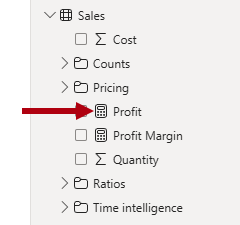
A measure is a named DAX formula that's added to a model table. It achieves summarization, and it appears in the Data pane with a calculator icon. Measure names must be unique within the model. Measures can be simple, such as SUM or AVERAGE. Measures can also be complex and calculate the Sales Amount minus Product Cost to find the Profit.
These calculations extend the data in your semantic model by providing the essential calculations required for effective data visualization, enabling you to uncover deeper insights and trends within your data.
Note
If the model is queried by using Multi-Dimensional Expressions (MDX), which is the case when you use Analyze in Excel, then you must also create measures.
If you don't have DAX skills, you can use Copilot for Power BI to generate a measure based on a prompt. You can also use the Quick measures feature.
Use Quick measures
Quick measures allow you to create a measure by selecting a calculation template and dragging fields to configure it. Power BI Desktop then creates a measure based on your configuration.

Like model columns, you can set description, synonym, display folder, and "is hidden" properties for measures. You can also set formatting properties. The Home table property allows assigning the measure to any model table.
Tip
You can also use Copilot to autogenerate a description value for the measure, which it does by inspecting the DAX formula. For more information, see the Copilot for Power BI documentation.
[7] Configure parameters
A parameter in Power BI lets users change report settings, like filters or calculations, without changing the original data. You can add two types of parameters to your model: Numeric range and Fields.
Create a Numeric range parameter
You define a Numeric range parameter by setting a numeric data type, minimum and maximum values, an increment value, and a default value. Power BI Desktop then creates a calculated table by using DAX. It also creates a measure that represents the value that's used to the filter the table. The table doesn't have (or need) a relationship to any other model table, creating a disconnected table.
A numeric range parameter can support a what-if scenario, where the report consumer uses a slicer to filter the table, and measures do something relevant with the selected value. For example, a report could allow the report consumer to set a hypothetical currency exchange rate. A report visual could then display a measure that applies the exchange rate in a meaningful way.
Parameters appear in the Data pane with a question mark symbol (?).
In the following screenshot, the Exchange Rate table is the calculated table, and the Exchange Rate column contains the numeric range values. The Exchange Rate Value is a measure that returns the select value in the range.

Create a Fields parameter
You can define a Fields parameter by creating a group of different fields. The parameter field can then be used in visuals and also to set up a slicer. Slicer selection allows report consumers to choose which field to visualize.
Consider an example where a fields parameter named Product Grouping comprises four columns from the Product table: Category, Subcategory, Product, and Color. When the parameter is added to the report page, the report consumer can select which field. The corresponding bar chart places the selected field on its Y-axis.

[8] Exercise - Configure a semantic model in Power BI Desktop
This unit includes a lab to complete.
Use the free resources provided in the lab to complete the exercises in this unit. You will not be charged for the lab environment; however, you may need to bring your own subscription depending on the lab.
Microsoft provides this lab experience and related content for educational purposes. All presented information is owned by Microsoft and intended solely for learning about the covered products and services in this Microsoft Learn module.
In this exercise, you learn how to:
Create model relationships.
Configure table and column properties.
Create hierarchies.
This lab takes approximately 45 minutes to complete.
Note
A virtual machine containing the client tools you need is provided, along with the exercise instructions. Use the "Launch lab" button to launch the virtual machine.
A limited number of concurrent sessions are available. If the hosted environment is unavailable, please try again later.
Alternatively, you can open the instructions in a separate window.
Access your environment
Before you start this lab (unless you are continuing from a previous lab), select Launch lab above.
You are automatically logged in to your lab environment as data-ai\student.
You can now begin your work on this lab.
Tip
To dock the lab environment so that it fills the window, select the PC icon at the top and then select Fit Window to Machine.

[9] Check your knowledge
[1] What cardinality type should you set to create a relationship between a dimension table to a fact table?
a. Many-to-many
b. One-to-many
c. One-to-one
[2] Which statement about hierarchies is true?
a. A hierarchy orders column values.
b. At most, only one hierarchy can be added to a model table.
c. Hierarchy levels must be based on columns from a single model table.
[3] What type of object can you add to a model to summarize data?
a. Hierarchy
b. Measure
c. Parameter
[10] Summary
In this module, you learned how to develop a semantic layer over your data.
First, you learned about the importance of model relationships and their role to automatically propagate filters to other model tables.
Next, you learned how to create and configure model objects, including tables, columns, hierarchies, measures, and parameters. The end result is a model that delivers your reporting requirements, and that's user-friendly and intuitive.
Source:
https://learn.microsoft.com/en-us/training/modules/configure-semantic-model-power-bi/