Power BI 102: Connect, Transform, and Load Data

Mohamad's interest is in Programming (Mobile, Web, Database and Machine Learning). He is studying at the Center For Artificial Intelligence Technology (CAIT), Universiti Kebangsaan Malaysia (UKM).
Power BI is a business data analysis tool that allows users to connect to various data sources, transform and model the data, create interactive visualizations, and share reports with other users.
[1] Get data
For beginners, Microsoft provides some spreadsheet files which could help them to quickly grasp the basics. One of them will be used for this exercise.
The spreadsheet file can be downloaded from https://go.microsoft.com/fwlink/?LinkID=521962. Alternatively, download from here (Financial Sample.xlsx).
The file is also available in the current version of Power BI application itself.
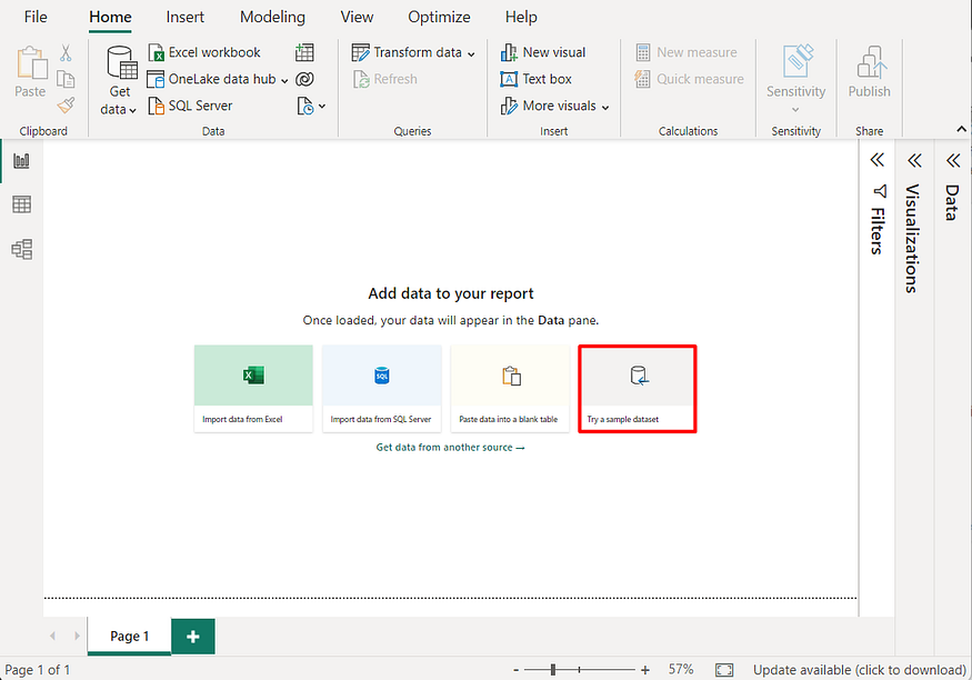
In the main panel of the application window, click Try a sample dataset.
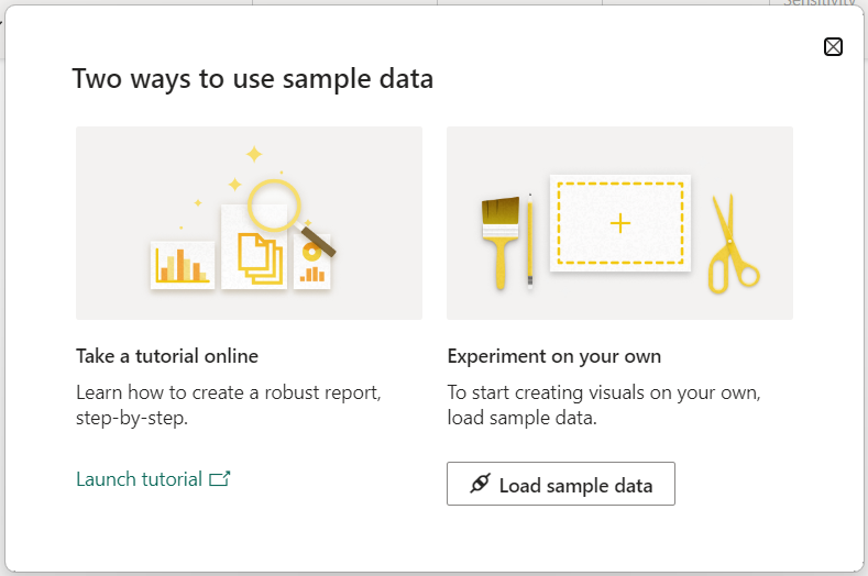
In the next dialog window, click Load sample data.
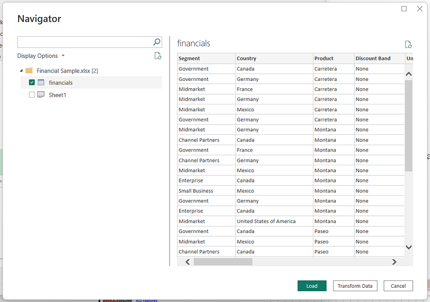
In the Navigation window, select the table financials, and then Click Transform data button.
[2] Transform Data
Data transformation is a process where the original dataset structure is rearranged to make it more convenient for data visualization process.
[2.1] Select fields
Press [CTRL] key and click the fields Country, Products and Sales consecutively.
Right-click the field Salesand select Remove Other Columns.
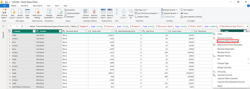
As a result, all fields will be removed except for the selected fields above.
Click the icon for the Close & Apply button.
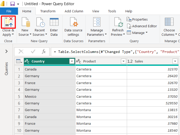
Power BI will close the Power Query Editor window and transfer the query into the Visualization window.
[3] Visualize the data
[3.1] Create a Map
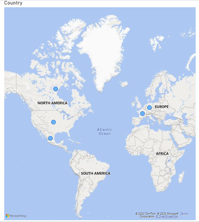
Click the field Country. Power BI will automatically create a Map for the field.
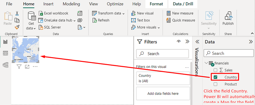
Note: If Power BI issues a warning message that says “Map and filled map visuals are disabled”, users need to click the menu File/Options_and _Settings/Options. Next, select the Security option in the left panel. Finally, check the option “Use Map and Filled Map visuals”.
Enlarge the map.
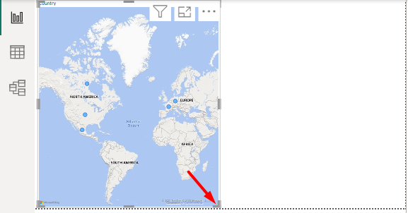
Power BI map is a data visualization tool that allows users to create interactive maps to represent location-based data.
In this example, the map shows the distribution of customer locations in Europe and North America.
[3.2] Create a stack column chart
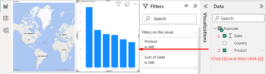
Click on the blank canvas to right of the map.
Click the Sales field and then click Product field.
Power BI will automatically create a Stack column chart for the fields.
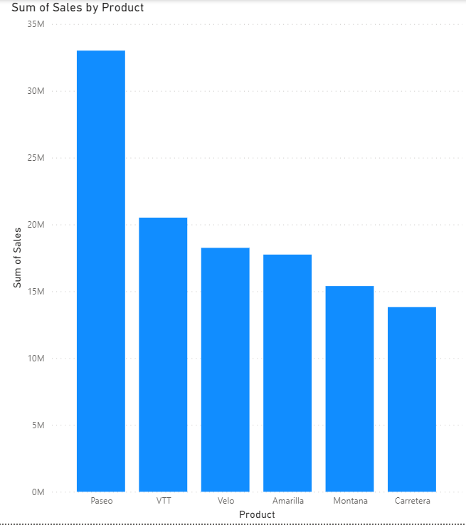
Power BI stacked column chart is a type of chart that displays data in vertical columns, where each column represents a category, and the height of the column represents the value of that category.
In this example, Power BI correctly plots Product and Sales into the x and y axis respectively.
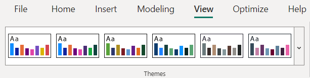
[4] Enhance the design
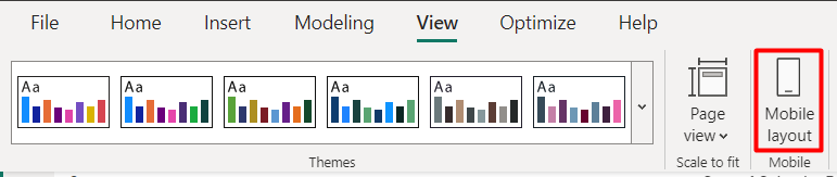
Users can select the View Ribbon and apply predefined theme to the design
The recent Power BI version (this post uses Version 2.118) also provides a separate Mobile Layout design which would help to fit the visualization into the small screens.