Power BI 104: Prepare Data, Generate Report

Mohamad's interest is in Programming (Mobile, Web, Database and Machine Learning). He is studying at the Center For Artificial Intelligence Technology (CAIT), Universiti Kebangsaan Malaysia (UKM).
You can start building the Power BI Report by following the simple steps given below:
Step 1: Extract Data
Step 2: Prepare Your Data
Step 3: Generate Your Report
Step 1: Extract Data
Step 1: Download this sample Excel workbook(Financial Sample.xlsx)
Step 2: Open Power BI Desktop. Navigate to the Home ribbon and click on the Excel option present in the Data section.
Step 3: Go to the folder where you have saved your workbook and click on the Open button after selecting the file.
Step 2: Prepare Your Data
Now, a Navigator window will pop up on your screen. It displays an overview of the data so you can be sure that the range of the data is correct. For instance, all the numeric data types are shown in italics. Navigator allows you to transform your data before loading it. Transforming the data can often assist you in creating visualizations that are easier to understand. Follow the steps given below to perform various transformations:
- Step 1: Check the box next to Financials and click on the Transform Data button.

- Step 2: In the given sample data, values of units sold in decimal don’t make sense. Hence, you can transform it into whole numbers. Select the Units sold column and navigate to Transform Tab > Data Type > Whole Number. Click on the Replace current option to change the data type.

- Step 3: To make the segments easier to observe in the visualizations, later on, you can change its format to uppercase. To do that, select the Segments column and navigate to Transform tab > Format > UPPERCASE.

- Step 4: You can shorten the Month Name Column header to Month by just double-clicking the Month Name column, and renaming it to just Month.

- Step 5: For this sample data, it is assumed that the Montana product was discontinued last month, so you can filter this data from your report to avoid confusion. To do that, go to the Product column. Click on the dropdown and clear the box next to Montana.

You can now observe that each transformation has been added to the list under Query Settings in Applied Steps.

- Step 6: Since your data is now prepared, you can go to the Home tab and save the modification by clicking on the Close & Apply option.
You can also notice that Power BI has recognized various field such as Sales, Discounts, etc. of numeric data types by placing a Sigma symbol. It has also denoted the Date field as a Date time entity by placing a Calendar icon.

Step 3: Generate Your Report
After the data preparation step, you can now move toward creating your reports. To do that, follow these simple steps:
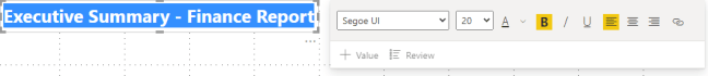
Step 1: Go to the Insert ribbon on the top, and click on the Text Box option. You can now type the title for this report as “Executive Summary – Finance Report”.
Step 2: Select the text you typed and set the font size to 20 and bold. You can also resize the box for the text to be in one line.
Step 3: To create a line chart to see which month and year had the maximum profit, go to the Fields pane. Drag the Profit field to a blank area on the report canvas. You will notice that Power BI displays a column chart with one column, Profit.
Step 4: Similarly, drag the Date field. You now will see the profit columns for 2 years.

- Step 5: To view profits for each month, go to the Fields section of the Visualizations pane. Click on the drop-down in the Axis value and change Date from Date Hierarchy to Date.

Now, Power BI will display profits month-wise.

- Step 6: You can change the bar chart to a line chart from the Visualization pane.

- Step 7: To see which country had the highest profits, drag the Country field from the Fields pane to a blank area on your report canvas to create a map. Then, drag the Profit field to the map.

Step 8: You can also find out which companies and segments to invest in. To do that, first, you can create some space by dragging the two charts you’ve built to be aligned side by side in the top half of the canvas.
Step 9: Click on the blank area in the lower half of your report canvas and select the Sales, Product, and Segment fields from the Fields pane. After you observe a chart, you can drag it to fill the space under the two upper charts.
